

Mixing & Matching COMPLEMENTARY COLORS
Color is such a huge part of our lives. It’s what catches our attention and attracts us to most things on a daily basis. We choose colors for things in our homes, accessories we buy, and clothing we wear. If you spend any portion of your day in the creative process, you know that color plays a huge part in design also. Basically, we spend a whole lot of time mixing, matching, and choosing colors!

But how do we make confident choices when it comes to this?
Confidence doesn’t always come easy when it means going for the bright yellow throw pillow, wearing that bright green skirt, or finding just the right color edits for a portrait you shot. This is simply because were not really sure how to use them!
We just need a little confidence in the process.
One of the most basic, yet sophisticated color schemes in my opinion are the COMPLEMENTARY COLORS.
Here’s a little bit about the what, why, & how…
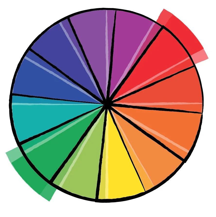
Red & Green
WHAT ARE THEY?
Complementary colors are ones that are opposition one another on the color wheel.
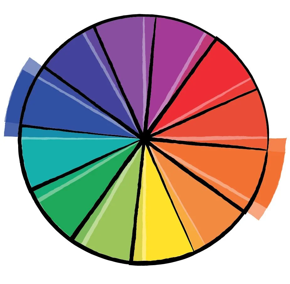
Orange & Blue
Together, they are powerful in a design because of the high level of contrast.
You notice them grabbing your attention with their brilliant level of intensity.
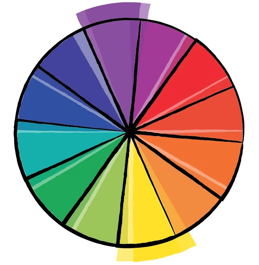
Yellow & Violet
Complementary literally means the combination multiple things in a way that enhances or supports the other. It makes total sense!
HOW TO USE THEM
Check out the tiny bit of purple in the background.
There is a lot of science to how our brains and eyes connect visually to understand color, but the bottom line is our eyes are drawn to those complements. The key to actually using them is to include a tiny bit of one and more of the other. Going half/half with these colors makes it difficult to visually focus on. That little pop of the complement is what our eyes subconsciously search for. In fact, these colors together can actually give you a sense of balance.
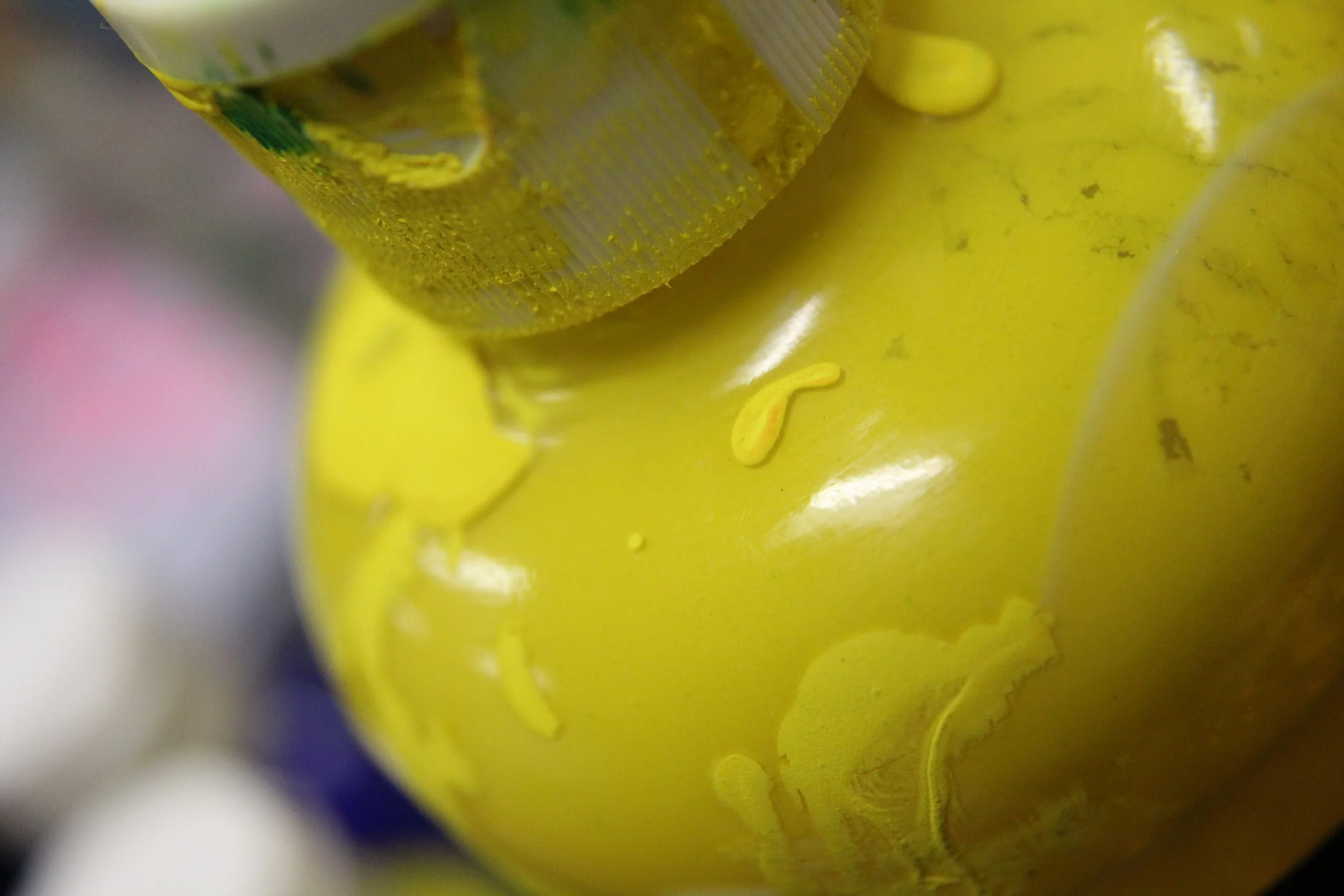
MIXING THEM
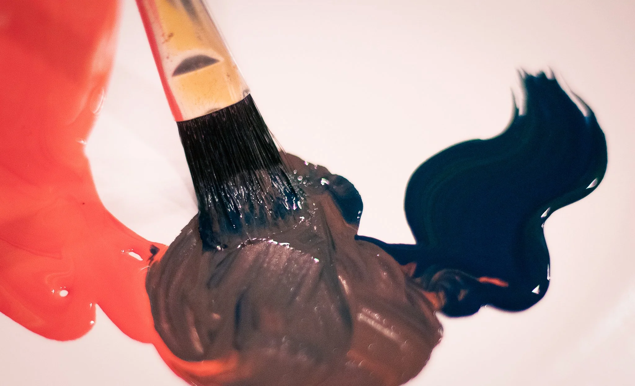
Mixing two of them also creates lovely neutrals. This can also help to bring down the vibrancy of hues making them a bit more muted. Results vary depending on the amounts of each color added.
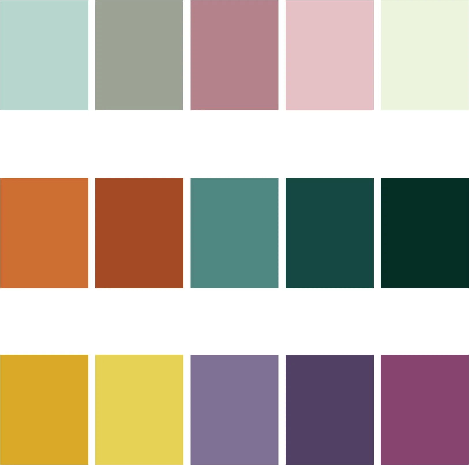
SOME TRENDING PALETTES
Keep in mind, these colors are not limited to just one hue! Pink is just a tint of red, making it a totally possible option for a red & green complementary palette. Same is true for those darker shades. The options are endless!
Pinterest is a great tool for searching up popular or trending complementary color palettes. If you are stuck and in desperate need of inspiration, give this search a try.
I am a believer that bold colors are for the adventurous and neutral ones are for the wary. If you are looking to make a statement with that bold, audacious pop of color, you know where to start!